Film Poster design I Kazakhstan, Almaty I 2021:
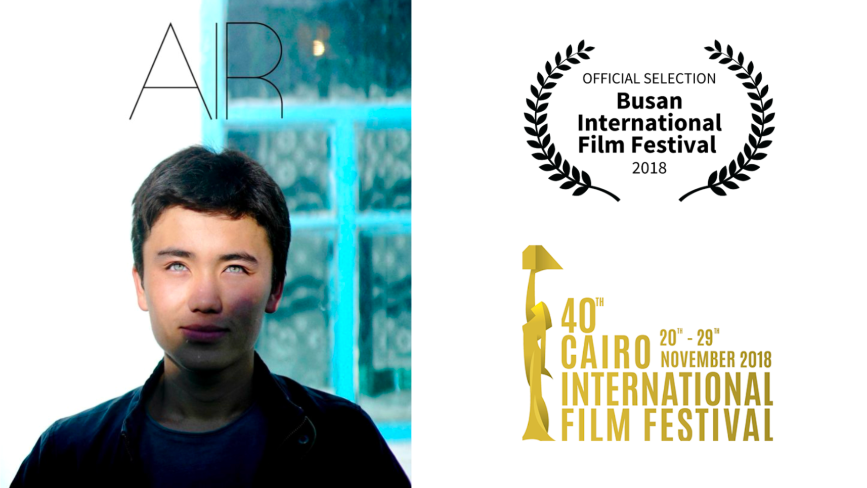
In 2021, I designed a film poster for the drama film "OT," directed by Aizhan Kassymbek, where I also took part as a production designer. The intention was to encourage an audience and capture the atmosphere of the film.
Cinematic atmosphere:
Having seen the film from behind the scenes, I was able to design a poster that represents the range of emotions that accompany both the dramatic and comedic sections of the film. Viewers would be drawn in by the visual narrative that was achieved by a combination of color, typography, and graphic illustration that all matched the mood of the movie. The final version of the poster has bright, opposing colors that provide humor, and the warm background and the main character's reactions speak to the difficult nature of his job as a bread delivery driver.
Encourage audience:
The poster creates the impression of a teaser by giving details that draw attention to the film's premiere without telling the whole story. This is why the unique digital drawing method used to create the "OT" movie poster stands out from others.
Design variations:
Understanding the importance of creative choices, I designed several versions of the poster. Each version explores different visual approaches, which allows the director and producer to see multiple variations and decide which one presents the vision of the film the best. So, the promotional materials were aligned with the artistic direction of the film.
I was available to create a poster that accurately captured the spirit of the movie while also encouraging viewers visually. The film's story and tone were clearly communicated in the final poster, bringing visitors to the cinema and increasing the overall marketing plan.
make waffles - not walls I Germany, Berlin I 2024
In a society where people are divided by metaphorical and physical boundaries, the 4D animation "Make Waffles, Not Walls" sends an important message about the power of unity. The project illustrates the idea that sharing emotions can break down barriers.
With its complex grid structure, the waffle represents connection, where each square symbolizes individuals in a community. The switch from walls to waffles highlights the transformational potential of collaboration.
This project encourages unity and collaboration by using two global languages: food and animation. Making waffles might bring people together, create connections, and remind us of how similar we all are.
Brochure Design I Germany, Siegen I 2022
I designed brochure graphics for a German software company in the autumn of 2022.
Using the company's brand colors, I create explanation brochures on three different themes in one unique art style. Specially created digital graphics and custom icons were made to match the company's visual brand. The working process includes specific skills and difficulties.
Branding:
The branding color palette is important to the design process because it is a fundamental component of the company's identity, which expresses its values and positioning in the market rather than just a visual preference.
The company's main color palette:
Custom icons:
The icons not only need to be aligned with the brand's aesthetic but also functional. Each icon was created to make sure the meaning was understood. This process involved several stages, from different kinds of sketches to digital realization, where each icon fits inside the company's design language.
Integration and Layout:
Integrating these elements—brand colors, icons, and illustrations—in the brochure design is a strategic approach to layout. Each page was designed to guide the reader through the content smoothly, with a clear hierarchy of information.
The brochure design for the German company was successfully realized when printing versions of each specific field brochure were used as promotion material for the software development company at international trade fairs.


